# Grid Lineup
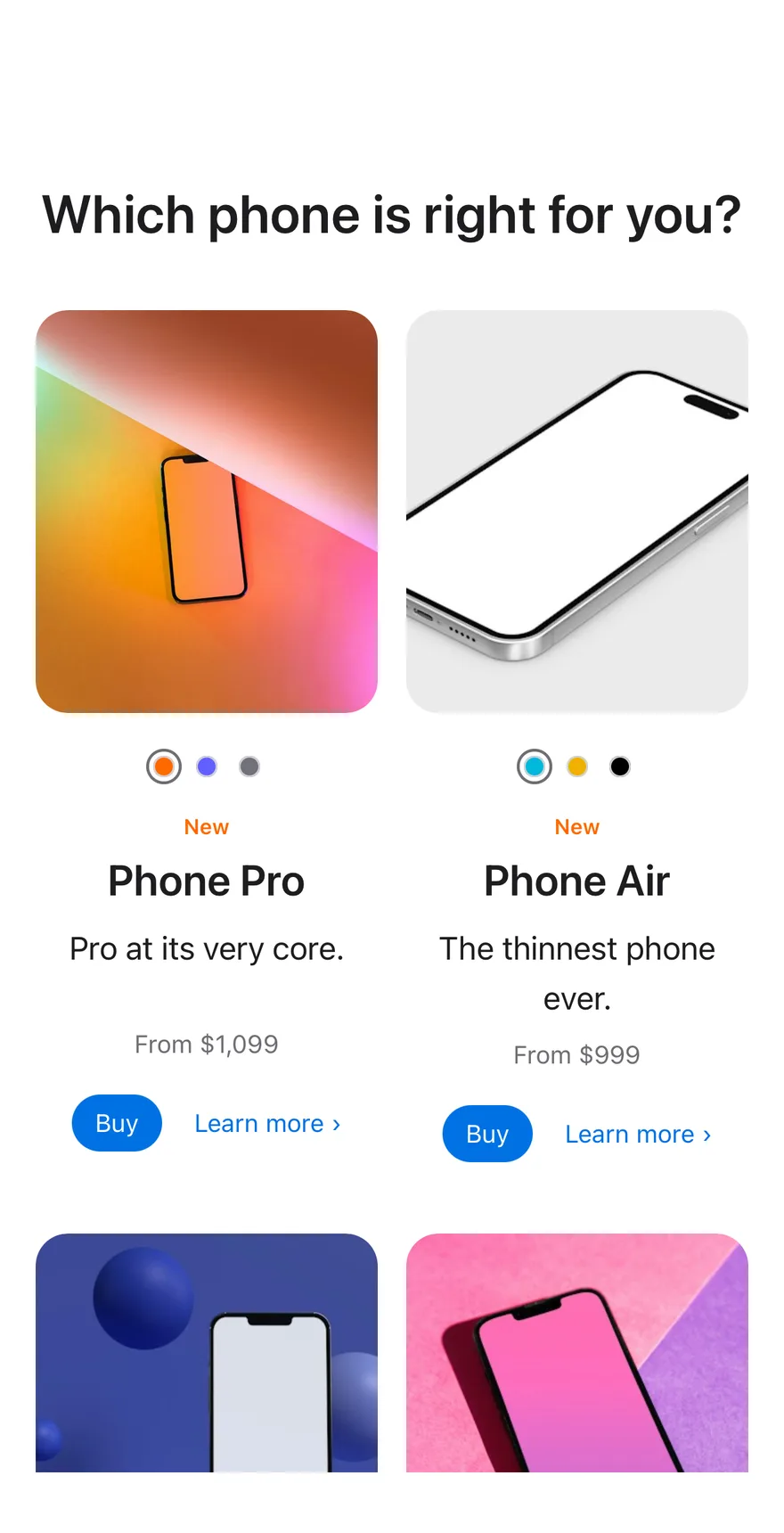
A product lineup comparing models side by side, each with finish swatches, a price, and buy actions.
Grid Lineup is an open-source block from suiss/ui for React, React Native, SwiftUI and Jetpack Compose. The @esuiss/ui CLI copies its source into your project, so you own the code.
Source: https://ui.suiss.app/docs/blocks/grid-lineup
**React**
**Example**
```tsx title="components/blocks/grid-lineup.tsx"
"use client"
import * as React from "react"
import { Button } from "@/components/ui/button"
import { ToggleGroup, ToggleGroupItem } from "@/components/ui/toggle-group"
const photo = (id: string) =>
`https://images.unsplash.com/photo-${id}?w=600&q=80&auto=format&fit=crop`
type Finish = { label: string; color: string }
const models: {
name: string
tagline: string
price: string
kicker?: string
image: string
alt: string
finishes: [Finish, ...Finish[]]
}[] = [
{
name: "Phone Pro",
tagline: "Pro at its very core.",
price: "$1,099",
kicker: "New",
image: photo("1714972384975-fbd4f19b1bb3"),
alt: "An orange phone on a warm gradient",
finishes: [
{ label: "Cosmic Orange", color: "oklch(0.68 0.16 50)" },
{ label: "Deep Blue", color: "oklch(0.38 0.07 262)" },
{ label: "Silver", color: "oklch(0.9 0.006 260)" },
],
},
{
name: "Phone Air",
tagline: "The thinnest phone ever.",
price: "$999",
kicker: "New",
image: photo("1664883410931-2edffc8be5e6"),
alt: "A silver phone on a light grey background",
finishes: [
{ label: "Sky Blue", color: "oklch(0.92 0.01 230)" },
{ label: "Light Gold", color: "oklch(0.86 0.04 80)" },
{ label: "Space Black", color: "oklch(0.3 0.01 260)" },
],
},
{
name: "Phone",
tagline: "Better in every way.",
price: "$799",
image: photo("1714578187196-29775454aa39"),
alt: "A phone floating among blue spheres",
finishes: [
{ label: "Lavender", color: "oklch(0.82 0.06 290)" },
{ label: "Sage", color: "oklch(0.85 0.07 160)" },
{ label: "Mist Blue", color: "oklch(0.88 0.04 240)" },
{ label: "Black", color: "oklch(0.3 0.01 260)" },
],
},
{
name: "Phone e",
tagline: "Speed. Battery. Value.",
price: "$599",
image: photo("1703676311066-34caf2cbee33"),
alt: "A phone on a pink and purple backdrop",
finishes: [
{ label: "Black", color: "oklch(0.3 0.01 260)" },
{ label: "White", color: "oklch(0.97 0 0)" },
],
},
]
function LineupModel({ model }: { model: (typeof models)[number] }) {
const [finish, setFinish] = React.useState(model.finishes[0].label)
return (
 {
if (value[0]) setFinish(value[0])
}}
aria-label={`${model.name} finish`}
spacing={2}
className="mt-5.5"
>
{model.finishes.map((item) => (
))}
{model.kicker}
{
if (value[0]) setFinish(value[0])
}}
aria-label={`${model.name} finish`}
spacing={2}
className="mt-5.5"
>
{model.finishes.map((item) => (
))}
{model.kicker}
{model.name}
{model.tagline}
From {model.price}
)
}
export function GridLineup() {
return (
Which phone is right for you?
{models.map((model) => (
))}
)
}
```
A side-by-side model comparison where each model shows a photo, finish swatches, a name and tagline, a starting price, a Buy button and a Learn more link. Models sit two per row, or four on large screens, and the text blocks keep a fixed height so prices line up. Use it for a product family page or any plan or tier lineup.
## Installation
### CLI
```bash title="Terminal"
npx shadcn@latest add @esuiss/grid-lineup
```
Works in any project with a `components.json`. See [Installation](https://ui.suiss.app/docs/installation#add-components) for the one-line registry setup. Or use the suiss/ui CLI:
```bash title="Terminal"
npx @esuiss/ui@latest add blocks grid-lineup
```
### Manual
1. Add the pieces it builds on: [Button](https://ui.suiss.app/docs/components/button), [Toggle Group](https://ui.suiss.app/docs/components/toggle-group).
2. Copy the source into `components/blocks/grid-lineup.tsx`:
```tsx title="components/blocks/grid-lineup.tsx"
"use client"
import * as React from "react"
import { Button } from "@/components/ui/button"
import { ToggleGroup, ToggleGroupItem } from "@/components/ui/toggle-group"
const photo = (id: string) =>
`https://images.unsplash.com/photo-${id}?w=600&q=80&auto=format&fit=crop`
type Finish = { label: string; color: string }
const models: {
name: string
tagline: string
price: string
kicker?: string
image: string
alt: string
finishes: [Finish, ...Finish[]]
}[] = [
{
name: "Phone Pro",
tagline: "Pro at its very core.",
price: "$1,099",
kicker: "New",
image: photo("1714972384975-fbd4f19b1bb3"),
alt: "An orange phone on a warm gradient",
finishes: [
{ label: "Cosmic Orange", color: "oklch(0.68 0.16 50)" },
{ label: "Deep Blue", color: "oklch(0.38 0.07 262)" },
{ label: "Silver", color: "oklch(0.9 0.006 260)" },
],
},
{
name: "Phone Air",
tagline: "The thinnest phone ever.",
price: "$999",
kicker: "New",
image: photo("1664883410931-2edffc8be5e6"),
alt: "A silver phone on a light grey background",
finishes: [
{ label: "Sky Blue", color: "oklch(0.92 0.01 230)" },
{ label: "Light Gold", color: "oklch(0.86 0.04 80)" },
{ label: "Space Black", color: "oklch(0.3 0.01 260)" },
],
},
{
name: "Phone",
tagline: "Better in every way.",
price: "$799",
image: photo("1714578187196-29775454aa39"),
alt: "A phone floating among blue spheres",
finishes: [
{ label: "Lavender", color: "oklch(0.82 0.06 290)" },
{ label: "Sage", color: "oklch(0.85 0.07 160)" },
{ label: "Mist Blue", color: "oklch(0.88 0.04 240)" },
{ label: "Black", color: "oklch(0.3 0.01 260)" },
],
},
{
name: "Phone e",
tagline: "Speed. Battery. Value.",
price: "$599",
image: photo("1703676311066-34caf2cbee33"),
alt: "A phone on a pink and purple backdrop",
finishes: [
{ label: "Black", color: "oklch(0.3 0.01 260)" },
{ label: "White", color: "oklch(0.97 0 0)" },
],
},
]
function LineupModel({ model }: { model: (typeof models)[number] }) {
const [finish, setFinish] = React.useState(model.finishes[0].label)
return (
{
if (value[0]) setFinish(value[0])
}}
aria-label={`${model.name} finish`}
spacing={2}
className="mt-5.5"
>
{model.finishes.map((item) => (
))}
{model.kicker}
{model.name}
{model.tagline}
From {model.price}
)
}
export function GridLineup() {
return (
Which phone is right for you?
{models.map((model) => (
))}
)
}
```
3. Update the import paths to match your project.
## Usage
```tsx
import { GridLineup } from "@/components/blocks/grid-lineup"
```
```tsx
```
Edit `models`; each has a name, tagline, formatted price, optional kicker, image, alt text and a list of finishes with a label and color. Picking a swatch changes only the selection, not the photo, so add per-finish images if you need them. Give Buy a handler and point the `#learn` links at real pages.
## Notes
Swatches are labeled with their finish names and have enlarged hit areas. Photos are Unsplash placeholders.
**React Native, SwiftUI, Jetpack Compose**
```tsx title="uniwind/components/blocks/grid-lineup.tsx"
import { cn } from "cn"
import * as React from "react"
import { Image, Pressable, ScrollView, View } from "react-native"
import { FadeInDown, ReduceMotion } from "react-native-reanimated"
import { AnimatedView } from "@/components/ui/animated-view"
import { Button } from "@/components/ui/button"
import { Screen } from "@/components/ui/screen"
import { Text } from "@/components/ui/text"
import { ToggleGroup, ToggleGroupItem } from "@/components/ui/toggle-group"
const photo = (id: string) =>
`https://images.unsplash.com/photo-${id}?w=600&q=80&auto=format&fit=crop`
type Finish = { label: string; swatch: string }
type Model = {
name: string
tagline: string
price: string
kicker?: string
image: string
alt: string
finishes: [Finish, ...Finish[]]
}
const MODELS: Model[] = [
{
name: "Phone Pro",
tagline: "Pro at its very core.",
price: "$1,099",
kicker: "New",
image: photo("1714972384975-fbd4f19b1bb3"),
alt: "An orange phone on a warm gradient",
finishes: [
{ label: "Cosmic Orange", swatch: "bg-orange-500" },
{ label: "Deep Blue", swatch: "bg-indigo-500" },
{ label: "Silver", swatch: "bg-zinc-500" },
],
},
{
name: "Phone Air",
tagline: "The thinnest phone ever.",
price: "$999",
kicker: "New",
image: photo("1664883410931-2edffc8be5e6"),
alt: "A silver phone on a light grey background",
finishes: [
{ label: "Sky Blue", swatch: "bg-cyan-500" },
{ label: "Light Gold", swatch: "bg-yellow-500" },
{ label: "Space Black", swatch: "bg-black" },
],
},
{
name: "Phone",
tagline: "Better in every way.",
price: "$799",
image: photo("1714578187196-29775454aa39"),
alt: "A phone floating among blue spheres",
finishes: [
{ label: "Lavender", swatch: "bg-purple-500" },
{ label: "Sage", swatch: "bg-teal-400" },
{ label: "Mist Blue", swatch: "bg-teal-500" },
{ label: "Black", swatch: "bg-black" },
],
},
{
name: "Phone e",
tagline: "Speed. Battery. Value.",
price: "$599",
image: photo("1703676311066-34caf2cbee33"),
alt: "A phone on a pink and purple backdrop",
finishes: [
{ label: "Black", swatch: "bg-black" },
{ label: "White", swatch: "bg-white" },
],
},
]
function LineupModel({
model,
onBuy,
onLearnMore,
}: {
model: Model
onBuy?: (name: string, finish: string) => void
onLearnMore?: (name: string) => void
}) {
const [finish, setFinish] = React.useState(model.finishes[0].label)
return (
{
if (value[0]) setFinish(value[0])
}}
accessibilityLabel={`${model.name} finish`}
spacing={1}
className="mt-5 self-center"
>
{model.finishes.map((item) => (
cn(
"size-5 h-5 min-w-0 rounded-full border-[1.5px] p-0 bg-transparent active:bg-transparent",
state.pressed ? "border-muted-foreground" : "border-transparent"
)
}
>
))}
{model.kicker ?? ""}
{model.name}
{model.tagline}
From {model.price}
onLearnMore?.(model.name)}
className="active:opacity-60"
>
Learn more ›
)
}
function GridLineup({
onBuy,
onLearnMore,
}: {
onBuy?: (name: string, finish: string) => void
onLearnMore?: (name: string) => void
}) {
const rows: Model[][] = []
for (let index = 0; index < MODELS.length; index += 2) {
rows.push(MODELS.slice(index, index + 2))
}
return (
Which phone is right for you?
{rows.map((row) => (
model.name).join("|")}
className="flex-row gap-4"
>
{row.map((model) => (
))}
))}
)
}
export { GridLineup }
```
```swift title="swift/Blocks/GridLineup.swift"
import PhosphorSwift
import SwiftUI
public struct GridLineup: View {
struct Finish: Identifiable {
let label: String
let color: Color
var id: String { label }
}
struct Model: Identifiable {
let name: String
let tagline: String
let price: String
var kicker: String?
let image: URL?
let alt: String
let finishes: [Finish]
var id: String { name }
}
static func photo(_ id: String) -> URL? {
URL(string: "https://images.unsplash.com/photo-\(id)?w=600&q=80&auto=format&fit=crop")
}
static var models: [Model] {
[
Model(name: "Phone Pro", tagline: "Pro at its very core.", price: "$1,099", kicker: "New", image: photo("1714972384975-fbd4f19b1bb3"), alt: "An orange phone on a warm gradient", finishes: [
Finish(label: "Cosmic Orange", color: Palette.orange500),
Finish(label: "Deep Blue", color: Palette.indigo500),
Finish(label: "Silver", color: Palette.zinc500),
]),
Model(name: "Phone Air", tagline: "The thinnest phone ever.", price: "$999", kicker: "New", image: photo("1664883410931-2edffc8be5e6"), alt: "A silver phone on a light grey background", finishes: [
Finish(label: "Sky Blue", color: Palette.cyan500),
Finish(label: "Light Gold", color: Palette.yellow500),
Finish(label: "Space Black", color: Palette.black),
]),
Model(name: "Phone", tagline: "Better in every way.", price: "$799", image: photo("1714578187196-29775454aa39"), alt: "A phone floating among blue spheres", finishes: [
Finish(label: "Lavender", color: Palette.purple500),
Finish(label: "Sage", color: Palette.teal400),
Finish(label: "Mist Blue", color: Palette.teal500),
Finish(label: "Black", color: Palette.black),
]),
Model(name: "Phone e", tagline: "Speed. Battery. Value.", price: "$599", image: photo("1703676311066-34caf2cbee33"), alt: "A phone on a pink and purple backdrop", finishes: [
Finish(label: "Black", color: Palette.black),
Finish(label: "White", color: Palette.white),
]),
]
}
private var onBuy: ((String, String) -> Void)?
private var onLearnMore: ((String) -> Void)?
public init(onBuy: ((_ model: String, _ finish: String) -> Void)? = nil, onLearnMore: ((_ model: String) -> Void)? = nil) {
self.onBuy = onBuy
self.onLearnMore = onLearnMore
}
public var body: some View {
Screen {
KeyboardScrollView {
VStack(spacing: 36) {
Text("Which phone is right for you?")
.scaledTextStyle(.xl3, weight: .semibold)
.multilineTextAlignment(.center)
.fixedSize(horizontal: false, vertical: true)
.accessibilityAddTraits(.isHeader)
LazyVGrid(columns: [GridItem(.flexible(), spacing: 16, alignment: .top), GridItem(.flexible(), spacing: 16, alignment: .top)], spacing: 40) {
ForEach(Self.models) { model in
GridLineupModel(model: model, onBuy: onBuy, onLearnMore: onLearnMore)
}
}
}
.padding(.horizontal, 20)
.padding(.vertical, 40)
}
}
}
}
private struct GridLineupModel: View {
let model: GridLineup.Model
let onBuy: ((String, String) -> Void)?
let onLearnMore: ((String) -> Void)?
@State private var finish: String
init(model: GridLineup.Model, onBuy: ((String, String) -> Void)?, onLearnMore: ((String) -> Void)?) {
self.model = model
self.onBuy = onBuy
self.onLearnMore = onLearnMore
_finish = State(initialValue: model.finishes.first?.label ?? "")
}
var body: some View {
VStack(spacing: 0) {
EsuissColor.secondary
.overlay {
AsyncImage(url: model.image) { phase in
if let image = phase.image {
image.resizable().scaledToFill()
}
}
}
.aspectRatio(0.85, contentMode: .fit)
.clipShape(RoundedRectangle(cornerRadius: Radius.xl2, style: .continuous))
.accessibilityLabel(Text(LocalizedStringKey(model.alt)))
HStack(spacing: 0) {
ForEach(model.finishes) { item in
GridLineupSwatch(finish: item, selected: item.label == finish) {
finish = item.label
}
}
}
.padding(.top, 10)
.accessibilityElement(children: .contain)
.accessibilityLabel(Text("\(model.name) finish"))
Group {
if let kicker = model.kicker {
Text(LocalizedStringKey(kicker))
} else {
Text(verbatim: " ")
}
}
.scaledFont(.xs, weight: .semibold)
.foregroundStyle(Color.adaptive(light: Palette.amber600, dark: Palette.amber400))
.padding(.top, 8)
Text(verbatim: model.name)
.scaledFont(.xl, weight: .semibold)
.padding(.top, 2)
Text(LocalizedStringKey(model.tagline))
.scaledFont(.lg)
.lineLimit(2, reservesSpace: true)
.padding(.top, 6)
Text("From \(model.price)")
.scaledFont(.sm)
.foregroundStyle(EsuissColor.mutedForeground)
.padding(.top, 6)
VStack(spacing: 4) {
Button("Buy") {
onBuy?(model.name, finish)
}
.buttonStyle(.variant(.default, size: .sm))
.accessibilityLabel(Text("Buy \(model.name)"))
Button("Learn more ›") {
onLearnMore?(model.name)
}
.buttonStyle(.variant(.link, size: .sm))
.accessibilityLabel(Text("Learn more about \(model.name)"))
}
.padding(.top, 14)
}
.multilineTextAlignment(.center)
.frame(maxWidth: .infinity)
}
}
private struct GridLineupSwatch: View {
let finish: GridLineup.Finish
let selected: Bool
let action: () -> Void
var body: some View {
Button(action: action) {
Circle()
.fill(finish.color)
.overlay {
Circle().strokeBorder(EsuissColor.foreground.opacity(0.15), lineWidth: 1)
}
.frame(width: 12, height: 12)
.padding(3)
.overlay {
if selected {
Circle().strokeBorder(EsuissColor.mutedForeground, lineWidth: 1.5)
}
}
.frame(width: 30, height: 44)
.contentShape(Rectangle())
}
.buttonStyle(.plain)
.accessibilityLabel(Text(LocalizedStringKey(finish.label)))
.accessibilityAddTraits(selected ? .isSelected : [])
.hapticFeedback(.selection, trigger: selected) { _, now in now }
}
}
```
```kt title="kotlin/blocks/GridLineup.kt"
package com.esuiss.ui.blocks
import androidx.compose.animation.animateColorAsState
import androidx.compose.animation.core.tween
import androidx.compose.foundation.background
import androidx.compose.foundation.border
import androidx.compose.foundation.clickable
import androidx.compose.foundation.interaction.MutableInteractionSource
import androidx.compose.foundation.interaction.collectIsPressedAsState
import androidx.compose.foundation.layout.Arrangement
import androidx.compose.foundation.layout.Box
import androidx.compose.foundation.layout.Column
import androidx.compose.foundation.layout.FlowRow
import androidx.compose.foundation.layout.Row
import androidx.compose.foundation.layout.aspectRatio
import androidx.compose.foundation.layout.fillMaxSize
import androidx.compose.foundation.layout.fillMaxWidth
import androidx.compose.foundation.layout.heightIn
import androidx.compose.foundation.layout.padding
import androidx.compose.foundation.layout.size
import androidx.compose.foundation.rememberScrollState
import androidx.compose.foundation.selection.selectable
import androidx.compose.foundation.selection.selectableGroup
import androidx.compose.foundation.shape.CircleShape
import androidx.compose.foundation.shape.RoundedCornerShape
import androidx.compose.foundation.text.BasicText
import androidx.compose.foundation.verticalScroll
import androidx.compose.runtime.Composable
import androidx.compose.runtime.getValue
import androidx.compose.runtime.mutableStateOf
import androidx.compose.runtime.remember
import androidx.compose.runtime.saveable.rememberSaveable
import androidx.compose.runtime.setValue
import androidx.compose.ui.Alignment
import androidx.compose.ui.Modifier
import androidx.compose.ui.graphics.Color
import androidx.compose.ui.graphics.graphicsLayer
import androidx.compose.ui.graphics.vector.ImageVector
import androidx.compose.ui.semantics.Role
import androidx.compose.ui.semantics.clearAndSetSemantics
import androidx.compose.ui.semantics.contentDescription
import androidx.compose.ui.semantics.heading
import androidx.compose.ui.semantics.semantics
import androidx.compose.ui.text.font.FontWeight
import androidx.compose.ui.text.style.TextAlign
import androidx.compose.ui.unit.dp
import com.adamglin.PhosphorIcons
import com.adamglin.phosphoricons.Fill
import com.adamglin.phosphoricons.Light
import com.adamglin.phosphoricons.fill.DeviceMobile as FillDeviceMobile
import com.adamglin.phosphoricons.fill.DeviceMobileCamera as FillDeviceMobileCamera
import com.adamglin.phosphoricons.fill.DeviceMobileSpeaker as FillDeviceMobileSpeaker
import com.adamglin.phosphoricons.light.DeviceMobile
import com.adamglin.phosphoricons.light.DeviceMobileCamera
import com.adamglin.phosphoricons.light.DeviceMobileSpeaker
import com.esuiss.ui.components.Button
import com.esuiss.ui.components.ButtonSize
import com.esuiss.ui.components.Icon
import com.esuiss.ui.components.Screen
import com.esuiss.ui.components.rememberHaptics
import com.esuiss.ui.theme.EsuissTheme
import com.esuiss.ui.theme.Palette
import com.esuiss.ui.theme.Typography
private class LineupFinish(val label: String, val color: Color)
private class LineupModel(
val name: String,
val tagline: String,
val price: String,
val icon: ImageVector,
val fill: ImageVector,
val alt: String,
val finishes: List,
val kicker: String? = null,
)
private val LineupModels = listOf(
LineupModel(
"Phone Pro",
"Pro at its very core.",
"$1,099",
PhosphorIcons.Light.DeviceMobileCamera,
PhosphorIcons.Fill.FillDeviceMobileCamera,
"An orange phone on a warm gradient",
listOf(LineupFinish("Cosmic Orange", Palette.orange500), LineupFinish("Deep Blue", Palette.indigo500), LineupFinish("Silver", Palette.zinc500)),
"New",
),
LineupModel(
"Phone Air",
"The thinnest phone ever.",
"$999",
PhosphorIcons.Light.DeviceMobileSpeaker,
PhosphorIcons.Fill.FillDeviceMobileSpeaker,
"A silver phone on a light grey background",
listOf(LineupFinish("Sky Blue", Palette.cyan500), LineupFinish("Light Gold", Palette.yellow500), LineupFinish("Space Black", Palette.black)),
"New",
),
LineupModel(
"Phone",
"Better in every way.",
"$799",
PhosphorIcons.Light.DeviceMobile,
PhosphorIcons.Fill.FillDeviceMobile,
"A phone floating among blue spheres",
listOf(
LineupFinish("Lavender", Palette.purple500),
LineupFinish("Sage", Palette.teal400),
LineupFinish("Mist Blue", Palette.teal500),
LineupFinish("Black", Palette.black),
),
),
LineupModel(
"Phone e",
"Speed. Battery. Value.",
"$599",
PhosphorIcons.Light.DeviceMobile,
PhosphorIcons.Fill.FillDeviceMobile,
"A phone on a pink and purple backdrop",
listOf(LineupFinish("Black", Palette.black), LineupFinish("White", Palette.white)),
),
)
@Composable
fun GridLineup(
modifier: Modifier = Modifier,
onBuy: (model: String, finish: String) -> Unit = { _, _ -> },
onLearnMore: (model: String) -> Unit = {},
) {
val colors = EsuissTheme.colors
Screen(modifier) {
Column(
Modifier
.fillMaxSize()
.verticalScroll(rememberScrollState())
.padding(horizontal = 20.dp, vertical = 40.dp),
) {
BasicText(
"Which phone is right for you?",
modifier = Modifier
.fillMaxWidth()
.padding(bottom = 36.dp)
.semantics { heading() },
style = Typography.xl3.copy(color = colors.foreground, fontWeight = FontWeight.SemiBold, textAlign = TextAlign.Center),
)
Column(verticalArrangement = Arrangement.spacedBy(40.dp)) {
LineupModels.chunked(2).forEach { pair ->
Row(horizontalArrangement = Arrangement.spacedBy(16.dp)) {
pair.forEach { model ->
LineupTile(model, Modifier.weight(1f), onBuy, onLearnMore)
}
}
}
}
}
}
}
@Composable
private fun LineupTile(
model: LineupModel,
modifier: Modifier,
onBuy: (String, String) -> Unit,
onLearnMore: (String) -> Unit,
) {
val colors = EsuissTheme.colors
var finish by rememberSaveable(model.name) { mutableStateOf(model.finishes.first().label) }
val current = model.finishes.firstOrNull { it.label == finish } ?: model.finishes.first()
val tint by animateColorAsState(current.color, tween(400), label = "finish")
Column(modifier, horizontalAlignment = Alignment.CenterHorizontally) {
Box(
Modifier
.fillMaxWidth()
.aspectRatio(0.85f)
.background(colors.muted, RoundedCornerShape(16.dp))
.clearAndSetSemantics { contentDescription = model.alt },
contentAlignment = Alignment.Center,
) {
Icon(model.fill, contentDescription = null, size = 88.dp, tint = tint)
Icon(model.icon, contentDescription = null, size = 88.dp, tint = colors.mutedForeground)
}
Row(
Modifier
.padding(top = 12.dp)
.selectableGroup()
.semantics { contentDescription = "${model.name} finish" },
) {
model.finishes.forEach { item ->
LineupSwatch(item, selected = item.label == finish) { finish = item.label }
}
}
BasicText(
model.kicker.orEmpty(),
modifier = Modifier
.padding(top = 6.dp)
.heightIn(min = 18.dp),
style = Typography.xs.copy(color = if (colors.isDark) Palette.amber400 else Palette.amber600, fontWeight = FontWeight.SemiBold),
)
BasicText(
model.name,
modifier = Modifier
.padding(top = 4.dp)
.semantics { heading() },
style = Typography.xl.copy(color = colors.foreground, fontWeight = FontWeight.SemiBold, textAlign = TextAlign.Center),
)
BasicText(
model.tagline,
modifier = Modifier.padding(top = 8.dp),
style = Typography.base.copy(color = colors.foreground, textAlign = TextAlign.Center),
minLines = 2,
)
BasicText(
"From ${model.price}",
modifier = Modifier.padding(top = 8.dp),
style = Typography.sm.copy(color = colors.mutedForeground),
)
FlowRow(
modifier = Modifier.padding(top = 16.dp),
horizontalArrangement = Arrangement.spacedBy(16.dp, Alignment.CenterHorizontally),
verticalArrangement = Arrangement.spacedBy(8.dp),
itemVerticalAlignment = Alignment.CenterVertically,
) {
Button("Buy", { onBuy(model.name, finish) }, size = ButtonSize.Sm)
LineupLink("Learn more ›") { onLearnMore(model.name) }
}
}
}
@Composable
private fun LineupSwatch(finish: LineupFinish, selected: Boolean, onSelect: () -> Unit) {
val colors = EsuissTheme.colors
val haptics = rememberHaptics()
val ring by animateColorAsState(if (selected) colors.mutedForeground else Color.Transparent, tween(200), label = "ring")
Box(
Modifier
.size(28.dp)
.selectable(
selected = selected,
interactionSource = remember { MutableInteractionSource() },
indication = null,
role = Role.RadioButton,
onClick = {
if (!selected) haptics.selection()
onSelect()
},
)
.semantics { contentDescription = finish.label },
contentAlignment = Alignment.Center,
) {
Box(
Modifier
.size(18.dp)
.border(1.5.dp, ring, CircleShape)
.padding(3.dp)
.background(finish.color, CircleShape)
.border(1.dp, colors.foreground.copy(alpha = 0.15f), CircleShape),
)
}
}
@Composable
private fun LineupLink(text: String, onClick: () -> Unit) {
val interaction = remember { MutableInteractionSource() }
val pressed by interaction.collectIsPressedAsState()
BasicText(
text,
modifier = Modifier
.graphicsLayer { alpha = if (pressed) 0.8f else 1f }
.clickable(interactionSource = interaction, indication = null, role = Role.Button, onClick = onClick)
.padding(vertical = 6.dp),
style = Typography.sm.copy(color = EsuissTheme.colors.primary),
)
}
```
Composes `Screen`, `ToggleGroup` color swatches, `Button` and `Text`. Each model keeps its own selected finish, which is passed along when Buy is pressed.
## Installation
**React Native**
```bash title="Terminal"
npx shadcn@latest add @esuiss-rn/grid-lineup
```
See [Installation](https://ui.suiss.app/docs/installation) for the `components.json` setup. Or use the suiss/ui CLI:
```bash title="Terminal"
npx @esuiss/ui@latest add grid-lineup
```
**SwiftUI**
```bash title="Terminal"
npx @esuiss/ui@latest add grid-lineup --platform swift
```
**Jetpack Compose**
```bash title="Terminal"
npx @esuiss/ui@latest add grid-lineup --platform kotlin
```
The CLI also adds what it builds on: [Button](https://ui.suiss.app/docs/components/button), [Screen](https://ui.suiss.app/docs/components/screen), [Text](https://ui.suiss.app/docs/components/text), [Toggle Group](https://ui.suiss.app/docs/components/toggle-group). On React Native it also adds the animated view `components/ui/animated-view.tsx`.
### Manual
**React Native**
**Uniwind**
1. Install the dependencies:
```bash title="Terminal"
npx expo install cn react-native-reanimated react-native-worklets
```
2. Add the pieces it builds on: [Button](https://ui.suiss.app/docs/components/button), [Screen](https://ui.suiss.app/docs/components/screen), [Text](https://ui.suiss.app/docs/components/text), [Toggle Group](https://ui.suiss.app/docs/components/toggle-group), and the animated view `components/ui/animated-view.tsx` from the next step.
3. Copy the animated view into `components/ui/animated-view.tsx`:
- `uniwind/components/ui/animated-view.tsx`: [source](https://github.com/e-suiss/ui/blob/main/packages/mobile/uniwind/components/ui/animated-view.tsx)
4. Copy the source into `components/blocks/grid-lineup.tsx`:
- `uniwind/components/blocks/grid-lineup.tsx`: shown above
5. Update the import paths to match your project.
**NativeWind**
1. Install the dependencies:
```bash title="Terminal"
npx expo install cn react-native-reanimated react-native-worklets
```
2. Add the pieces it builds on: [Button](https://ui.suiss.app/docs/components/button), [Screen](https://ui.suiss.app/docs/components/screen), [Text](https://ui.suiss.app/docs/components/text), [Toggle Group](https://ui.suiss.app/docs/components/toggle-group), and the animated view `components/ui/animated-view.tsx` from the next step.
3. Copy the animated view into `components/ui/animated-view.tsx`:
- `nativewind/components/ui/animated-view.tsx`: [source](https://github.com/e-suiss/ui/blob/main/packages/mobile/nativewind/components/ui/animated-view.tsx)
4. Copy the source into `components/blocks/grid-lineup.tsx`:
```tsx title="nativewind/components/blocks/grid-lineup.tsx"
import { cn } from "cn"
import * as React from "react"
import { Image, Pressable, ScrollView, View } from "react-native"
import { FadeInDown, ReduceMotion } from "react-native-reanimated"
import { AnimatedView } from "@/components/ui/animated-view"
import { Button } from "@/components/ui/button"
import { Screen } from "@/components/ui/screen"
import { Text } from "@/components/ui/text"
import { ToggleGroup, ToggleGroupItem } from "@/components/ui/toggle-group"
const photo = (id: string) =>
`https://images.unsplash.com/photo-${id}?w=600&q=80&auto=format&fit=crop`
type Finish = { label: string; swatch: string }
type Model = {
name: string
tagline: string
price: string
kicker?: string
image: string
alt: string
finishes: [Finish, ...Finish[]]
}
const MODELS: Model[] = [
{
name: "Phone Pro",
tagline: "Pro at its very core.",
price: "$1,099",
kicker: "New",
image: photo("1714972384975-fbd4f19b1bb3"),
alt: "An orange phone on a warm gradient",
finishes: [
{ label: "Cosmic Orange", swatch: "bg-orange-500" },
{ label: "Deep Blue", swatch: "bg-indigo-500" },
{ label: "Silver", swatch: "bg-zinc-500" },
],
},
{
name: "Phone Air",
tagline: "The thinnest phone ever.",
price: "$999",
kicker: "New",
image: photo("1664883410931-2edffc8be5e6"),
alt: "A silver phone on a light grey background",
finishes: [
{ label: "Sky Blue", swatch: "bg-cyan-500" },
{ label: "Light Gold", swatch: "bg-yellow-500" },
{ label: "Space Black", swatch: "bg-black" },
],
},
{
name: "Phone",
tagline: "Better in every way.",
price: "$799",
image: photo("1714578187196-29775454aa39"),
alt: "A phone floating among blue spheres",
finishes: [
{ label: "Lavender", swatch: "bg-purple-500" },
{ label: "Sage", swatch: "bg-teal-400" },
{ label: "Mist Blue", swatch: "bg-teal-500" },
{ label: "Black", swatch: "bg-black" },
],
},
{
name: "Phone e",
tagline: "Speed. Battery. Value.",
price: "$599",
image: photo("1703676311066-34caf2cbee33"),
alt: "A phone on a pink and purple backdrop",
finishes: [
{ label: "Black", swatch: "bg-black" },
{ label: "White", swatch: "bg-white" },
],
},
]
function LineupModel({
model,
onBuy,
onLearnMore,
}: {
model: Model
onBuy?: (name: string, finish: string) => void
onLearnMore?: (name: string) => void
}) {
const [finish, setFinish] = React.useState(model.finishes[0].label)
return (
{
if (value[0]) setFinish(value[0])
}}
accessibilityLabel={`${model.name} finish`}
spacing={1}
className="mt-5 self-center"
>
{model.finishes.map((item) => (
cn(
"size-5 h-5 min-w-0 rounded-full border-[1.5px] p-0 bg-transparent active:bg-transparent",
state.pressed ? "border-muted-foreground" : "border-transparent"
)
}
>
))}
{model.kicker ?? ""}
{model.name}
{model.tagline}
From {model.price}
onLearnMore?.(model.name)}
className="active:opacity-60"
>
Learn more ›
)
}
function GridLineup({
onBuy,
onLearnMore,
}: {
onBuy?: (name: string, finish: string) => void
onLearnMore?: (name: string) => void
}) {
const rows: Model[][] = []
for (let index = 0; index < MODELS.length; index += 2) {
rows.push(MODELS.slice(index, index + 2))
}
return (
Which phone is right for you?
{rows.map((row) => (
model.name).join("|")}
className="flex-row gap-4"
>
{row.map((model) => (
))}
))}
)
}
export { GridLineup }
```
5. Update the import paths to match your project.
**StyleSheet**
1. Install the dependencies:
```bash title="Terminal"
npx expo install react-native-reanimated react-native-worklets
```
2. Add the pieces it builds on: [Button](https://ui.suiss.app/docs/components/button), [Screen](https://ui.suiss.app/docs/components/screen), [Text](https://ui.suiss.app/docs/components/text), [Toggle Group](https://ui.suiss.app/docs/components/toggle-group), and the animated view `components/ui/animated-view.tsx` from the next step.
3. Copy the animated view into `components/ui/animated-view.tsx`:
- `stylesheet/components/ui/animated-view.tsx`: [source](https://github.com/e-suiss/ui/blob/main/packages/mobile/stylesheet/components/ui/animated-view.tsx)
4. Copy the source into `components/blocks/grid-lineup.tsx`:
```tsx title="stylesheet/components/blocks/grid-lineup.tsx"
import * as React from "react"
import { Image, Pressable, ScrollView, StyleSheet, View } from "react-native"
import { FadeInDown, ReduceMotion } from "react-native-reanimated"
import { AnimatedView } from "@/components/ui/animated-view"
import { Button } from "@/components/ui/button"
import { Screen } from "@/components/ui/screen"
import { Text } from "@/components/ui/text"
import {
fontSize,
palette,
radius,
type ThemeColors,
useTheme,
} from "@/components/ui/theme"
import { ToggleGroup, ToggleGroupItem } from "@/components/ui/toggle-group"
type Tone = keyof ThemeColors | keyof typeof palette
function tone(colors: ThemeColors, key: Tone) {
return { ...colors, ...palette }[key]
}
const photo = (id: string) =>
`https://images.unsplash.com/photo-${id}?w=600&q=80&auto=format&fit=crop`
type Finish = { label: string; swatch: Tone }
type Model = {
name: string
tagline: string
price: string
kicker?: string
image: string
alt: string
finishes: [Finish, ...Finish[]]
}
const MODELS: Model[] = [
{
name: "Phone Pro",
tagline: "Pro at its very core.",
price: "$1,099",
kicker: "New",
image: photo("1714972384975-fbd4f19b1bb3"),
alt: "An orange phone on a warm gradient",
finishes: [
{ label: "Cosmic Orange", swatch: "orange500" },
{ label: "Deep Blue", swatch: "indigo500" },
{ label: "Silver", swatch: "zinc500" },
],
},
{
name: "Phone Air",
tagline: "The thinnest phone ever.",
price: "$999",
kicker: "New",
image: photo("1664883410931-2edffc8be5e6"),
alt: "A silver phone on a light grey background",
finishes: [
{ label: "Sky Blue", swatch: "cyan500" },
{ label: "Light Gold", swatch: "yellow500" },
{ label: "Space Black", swatch: "black" },
],
},
{
name: "Phone",
tagline: "Better in every way.",
price: "$799",
image: photo("1714578187196-29775454aa39"),
alt: "A phone floating among blue spheres",
finishes: [
{ label: "Lavender", swatch: "purple500" },
{ label: "Sage", swatch: "teal400" },
{ label: "Mist Blue", swatch: "teal500" },
{ label: "Black", swatch: "black" },
],
},
{
name: "Phone e",
tagline: "Speed. Battery. Value.",
price: "$599",
image: photo("1703676311066-34caf2cbee33"),
alt: "A phone on a pink and purple backdrop",
finishes: [
{ label: "Black", swatch: "black" },
{ label: "White", swatch: "white" },
],
},
]
const styles = StyleSheet.create({
content: { paddingHorizontal: 20, paddingVertical: 40 },
title: {
...fontSize["3xl"],
fontWeight: "600",
textAlign: "center",
marginBottom: 36,
},
rows: { gap: 40 },
row: { flexDirection: "row", gap: 16 },
model: { flex: 1, alignItems: "center" },
image: { aspectRatio: 0.85, width: "100%", borderRadius: radius["2xl"] },
finishes: { marginTop: 20, alignSelf: "center" },
finish: {
width: 20,
height: 20,
minWidth: 0,
borderRadius: radius.full,
borderWidth: 1.5,
paddingHorizontal: 0,
alignItems: "center",
justifyContent: "center",
},
swatch: {
width: 12,
height: 12,
borderRadius: radius.full,
borderWidth: StyleSheet.hairlineWidth,
},
kicker: { ...fontSize.xs, fontWeight: "600", marginTop: 16, minHeight: 18 },
name: { ...fontSize["2xl"], fontWeight: "600", marginTop: 4 },
tagline: {
...fontSize.lg,
marginTop: 8,
minHeight: 50,
textAlign: "center",
},
price: { ...fontSize.sm, marginTop: 8 },
actions: {
marginTop: 18,
flexDirection: "row",
flexWrap: "wrap",
alignItems: "center",
justifyContent: "center",
columnGap: 18,
rowGap: 12,
},
link: { ...fontSize.sm },
})
function LineupModel({
model,
onBuy,
onLearnMore,
}: {
model: Model
onBuy?: (name: string, finish: string) => void
onLearnMore?: (name: string) => void
}) {
const { colors } = useTheme()
const [finish, setFinish] = React.useState(model.finishes[0].label)
return (
{
if (value[0]) setFinish(value[0])
}}
accessibilityLabel={`${model.name} finish`}
spacing={1}
style={styles.finishes}
>
{model.finishes.map((item) => (
[
styles.finish,
{
backgroundColor: "transparent",
borderColor: state.pressed
? colors.mutedForeground
: "transparent",
},
]}
>
))}
{model.kicker ?? ""}
{model.name}
{model.tagline}
From {model.price}
onLearnMore?.(model.name)}
style={({ pressed }) => pressed && { opacity: 0.6 }}
>
Learn more ›
)
}
function GridLineup({
onBuy,
onLearnMore,
}: {
onBuy?: (name: string, finish: string) => void
onLearnMore?: (name: string) => void
}) {
const rows: Model[][] = []
for (let index = 0; index < MODELS.length; index += 2) {
rows.push(MODELS.slice(index, index + 2))
}
return (
Which phone is right for you?
{rows.map((row) => (
model.name).join("|")}
style={styles.row}
>
{row.map((model) => (
))}
))}
)
}
export { GridLineup }
```
5. Update the import paths to match your project.
**SwiftUI**
1. Target iOS 17 or later.
2. Add the Swift package to your app:
```swift title="Package.swift"
.package(url: "https://github.com/phosphor-icons/swift", from: "2.1.0")
```
3. Copy the theme files every view uses:
- `swift/Theme/Theme.swift`: [source](https://github.com/e-suiss/ui/blob/main/packages/mobile/swiftui/Sources/EsuissUI/Theme/Theme.swift)
- `swift/Theme/Tokens.swift`: [source](https://github.com/e-suiss/ui/blob/main/packages/mobile/swiftui/Sources/EsuissUI/Theme/Tokens.swift)
4. Copy the source and every file it uses:
- `swift/Blocks/GridLineup.swift`: shown above
- `swift/Components/Button.swift`: see [Button](https://ui.suiss.app/docs/components/button.md)
- `swift/Components/ButtonGroup.swift`: see [Button Group](https://ui.suiss.app/docs/components/button-group.md)
- `swift/Components/Haptics.swift`: see [Haptics](https://ui.suiss.app/docs/components/haptics.md)
- `swift/Components/KeyboardScrollView.swift`: see [Keyboard Scroll View](https://ui.suiss.app/docs/components/keyboard-scroll-view.md)
- `swift/Components/Screen.swift`: see [Screen](https://ui.suiss.app/docs/components/screen.md)
- `swift/Components/TextVariant.swift`: [source](https://github.com/e-suiss/ui/blob/main/packages/mobile/swiftui/Sources/EsuissUI/Components/TextVariant.swift)
5. Add the files to your app target.
**Jetpack Compose**
1. Set `minSdk` to 24 or higher and add the dependencies:
```kotlin title="build.gradle.kts"
implementation(platform("androidx.compose:compose-bom:2026.09.00"))
implementation("androidx.compose.foundation:foundation")
implementation("androidx.compose.ui:ui")
implementation("com.adamglin:phosphor-icon-android:1.0.0")
```
2. Copy the theme files every view uses:
- `kotlin/theme/Theme.kt`: [source](https://github.com/e-suiss/ui/blob/main/packages/mobile/kotlin/ui/src/main/kotlin/com/esuiss/ui/theme/Theme.kt)
- `kotlin/theme/Tokens.kt`: [source](https://github.com/e-suiss/ui/blob/main/packages/mobile/kotlin/ui/src/main/kotlin/com/esuiss/ui/theme/Tokens.kt)
3. Copy the source and every file it uses:
- `kotlin/blocks/GridLineup.kt`: shown above
- `kotlin/components/Button.kt`: see [Button](https://ui.suiss.app/docs/components/button.md)
- `kotlin/components/ButtonGroup.kt`: see [Button Group](https://ui.suiss.app/docs/components/button-group.md)
- `kotlin/components/Content.kt`: [source](https://github.com/e-suiss/ui/blob/main/packages/mobile/kotlin/ui/src/main/kotlin/com/esuiss/ui/components/Content.kt)
- `kotlin/components/Haptics.kt`: see [Haptics](https://ui.suiss.app/docs/components/haptics.md)
- `kotlin/components/Icon.kt`: see [Icon](https://ui.suiss.app/docs/components/icon.md)
- `kotlin/components/Screen.kt`: see [Screen](https://ui.suiss.app/docs/components/screen.md)
4. Update the `com.esuiss.ui` package names to match your project.
## Usage
```tsx
import { GridLineup } from "@/components/blocks/grid-lineup"
```
```tsx
```
Replace `MODELS` with your lineup. Pass `onBuy` to receive the model name and finish, and `onLearnMore` for the Learn more link.